 501derful.org
(Thanks to Beth Kanter @Kanter on Twitter for her thoughts on this panel as well.)
This post summarizes the workshop/session I participated on at SXSW including the panel “Measuring Social Change and Media: Beyond BS.”
I had the honor of helping to design and participating on a two and half hour workshop on Digital and Social Media Measurement with Beth Kanter, her co-author KD Paine and social media nonprofit rock star Carie Lewis of the HSUS. KD and Beth took frameworks from their book – the Data-Informed Nonprofit (Crawl, Walk, Run, Fly Assessment) and 7 Steps of Measurement and then had Carie and I share how they have applied these to their organization’s measurement of digital and social media. We had a range of participants at different levels (govt, for profit and nonprofit) and a room at SXSW with fixed seats or what Beth likes to call “University Lecture” style. While this was a little at odds with an interactive format (people were often trapped in the middle of rows) we made it work.

If you are hungry for the content, check Slideshare from your house : ) Or check out these two curated collections of Tweets – one from me on Storify and the other from Beth Kanter.
What follows below are what Beth identified from our presentations as the “ah ha” moments of insight.
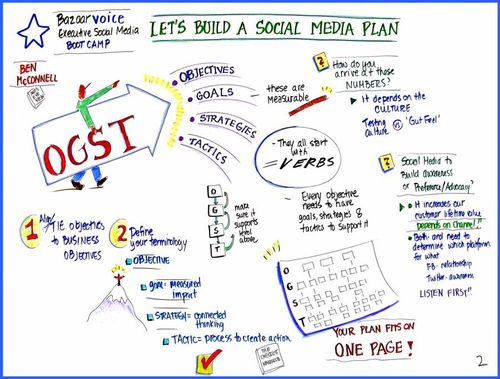
1. Know What Success Is
This something that every panelist said multiple times. David J. Neff said that even small nonprofits can do this and recommended framework called OGST. The conversation thread made me think of this excellent blog post by my two favorite nonprofit data geeks from DoSomething. They shared the story of one of their YouTube videos getting 1.5 million views and asking was that success? Well, the purpose of the video was to get teens to donate used sports equipment. But then looked at the conversion rate for the video it was a zero! KD Paine reminded us again that we become what we measure so choose wisely.
2. Don’t Be A Zoombie Repeating the Mistakes of the Past
During the CWRF Assessment, David J. Neff reflected on his nonprofit organization’s approach to sense-making of the data. One of the challenges they have is that while they collect data, they don’t always look at it and as a result they repeat mistakes. He pointed out that this happens with his organizations because it is a very small organization, grassroots with just a few volunteers running it. They have now made a focused effort to divide being charge of certain areas and to regularly communicate and look at their data.
3. Getting All Departments To Become Data Informed – Make It Fun
Carie Lewis shared a story about how having source codes for all their campaigns was essential to measuring all their campaigns, but it was hard to get the web team to buy into source coding. It was a change in their daily routines of publishing content: now they had to get a source code for each hyperlink they inserted. They did it for one campaign and when they saw the results, they were really excited. They felt accomplished. That was what it took to get them to accept. They created a “source jar” where if someone did the sourcing convention wrong (lazy) you had to put a quarter in the source jar. When they got enough money, they would all go out for ice cream. They haven’t gotten enough money yet!
4. Some Ways To Visual Your Data
KD Paine shared many, many insights . Including you have your data and you are looking at it, what are some ways to visualize it to get insights? KD says don’t use pie charts, plot your data over time. She also said that sorting and organizing your data in different ways can lead to seeing patterns. “Look across rows versus columns, for example.” She also advised us to use manual tracking for sentiment analysis because computers do not do nuance very well. At least not yet.